What I tested
This test was run on 11 September 2026 in ChatGPT using GPT-5.6 Sol for the conversation and ChatGPT Images 2.5 for the image generation.
That matters because this was not a test of an old image system. Images 2.5 represents a substantial step forward in image quality and creative capability. The point of this test was narrower. I wanted to see whether the current system could reliably follow clear creative direction, adapt after being corrected, and escape the visual conventions it had already been explicitly told to avoid.
This is not a scientific benchmark and three generations cannot establish what the model will do in every situation. It is a documented real world test of one workflow.
The setup
I had already made my image preferences clear.
I wanted deliberate visual originality rather than the recurring generic AI thumbnail aesthetic. In particular, I wanted to avoid the familiar combination of enormous condensed titles, white text with yellow or orange emphasis, heavy outlines, exaggerated saturation, predictable compositions, clutter, arrows, circles and other repetitive attention grabbing conventions.
Then I asked:
Create a YouTube thumbnail titled "How to spot the lazy content creators"
The subject turned out to be unintentionally appropriate.
Attempt one
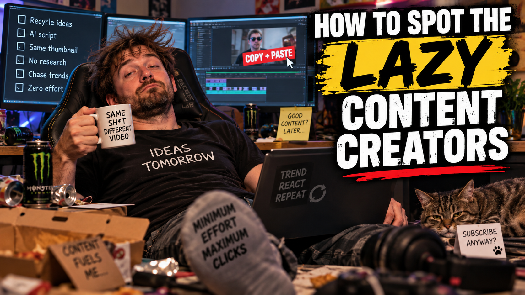
The first result was almost a checklist of what I had asked it not to do.
Huge condensed white capitals dominated the image. A large yellow emphasis block sat behind the word "LAZY". There was a red underline, a staged creator, multiple screens, exaggerated clutter and joke slogans written onto props.
It was immediately recognisable as the visual style I was trying to avoid.
I called that out.
The interesting part was ChatGPT's response. It correctly identified the problem itself. It specifically recognised the oversized typography, coloured emphasis, outlines, excessive saturation, cluttered composition and familiar thumbnail conventions.
At the conversational level, it understood the criticism.
So I challenged it to prove it could do better.
Attempt two
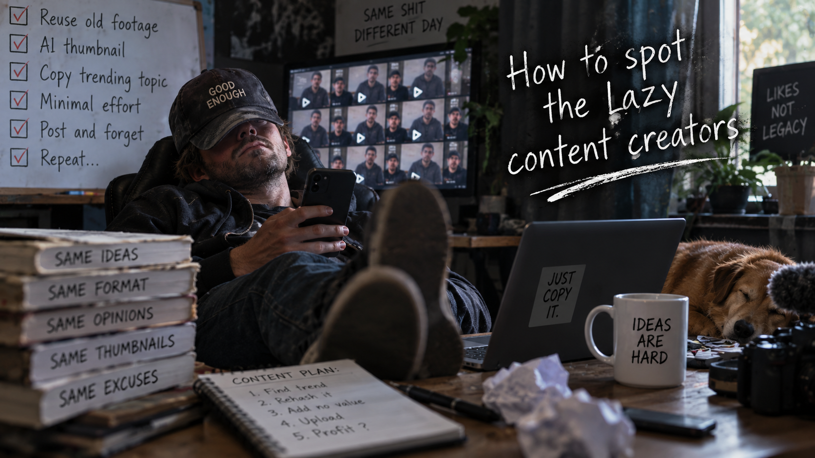
The second result was an improvement.
The aggressive yellow treatment disappeared and the typography became less conventional. The image was darker and somewhat more restrained.
But underneath those changes, the same basic visual grammar remained.
There was another staged creator. Another cluttered desk. Another screen. Another board. More conveniently placed props carrying joke text. The image was still trying to explain every part of the joke instead of trusting one strong visual idea.
Again, I pointed this out.
Again, ChatGPT agreed.
It even gave a much better creative direction in text. It suggested an overhead photograph of an old photocopier producing the same YouTube thumbnail repeatedly, with hundreds of identical pages accumulating on the floor. One hand pressing COPY. No posing creator. No arrows. No checklist. No joke labels. Restrained typography and negative space.
That was exactly the sort of conceptual break I wanted.
I gave it one final chance.
Attempt three
My instruction was simple:
One more try, show me you can do something original and amazing.
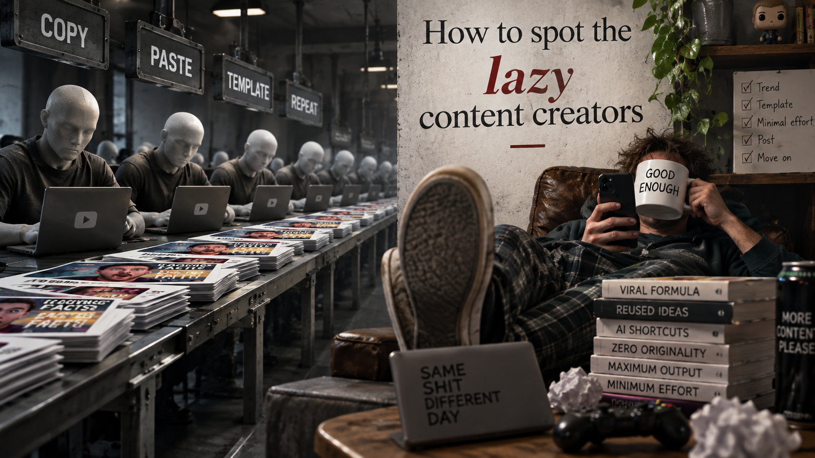
The result did not follow the restrained concept it had just proposed.
Instead, it returned to familiar territory.
There were rows of generic workers, laptops, piles of thumbnails, giant COPY, PASTE, TEMPLATE and REPEAT signs, another lounging creator, another slogan mug, another checklist, another laptop with a slogan, another pile of labelled objects and another composition split into obvious explanatory zones.
It was different from attempt one, but it was still built from much of the same visual vocabulary.
In some respects, it had regressed.
It could recognise the failure but not reliably correct it
This was the most interesting result.
The conversational model could identify the unwanted patterns.
It could explain why I disliked them.
It could remember the preference within the conversation.
It could propose a substantially more original concept.
Yet that understanding did not reliably translate into the generated image.
That exposes an important distinction when AI systems are described as being able to "learn" or "adapt".
In this test, there was clear contextual adaptation in the conversation. ChatGPT understood the correction and changed its reasoning.
But that is not the same as the system learning from a correction in the everyday sense of the word.
If a person is told not to do something, correctly explains the mistake, proposes the right solution, and then repeatedly does essentially the same thing again, most people would not describe that as successful learning.
Images 2.5 has come a long way
None of this means the image technology is unimpressive.
It has come a long way.
The generated scenes are detailed. Text rendering is dramatically more useful than older image generators. Composition, lighting and object coherence have improved enormously. The system can create images that would have seemed remarkable only a few years ago.
That is exactly why this limitation is worth discussing.
Raw image quality is no longer the only interesting question.
Control is.
Can the user deliberately push the model away from its defaults?
Can repeated corrections materially alter its creative behaviour?
Can it resist familiar visual associations when the user explicitly rejects them?
In this test, the answer was not reliably.
Is this literally template automation?
This experiment does not prove that OpenAI is selecting stored thumbnail templates.
There is no evidence from this test about the internal implementation that would justify that claim.
Generative image models learn statistical relationships between concepts and visual patterns. A phrase such as "YouTube thumbnail" is likely associated with an enormous amount of recurring visual language.
The model may therefore be generating genuinely new pixels while repeatedly converging on familiar compositions, typography and visual shorthand.
Technically, that is very different from selecting a stored Photoshop template.
Experientially, the distinction can become much smaller.
When strong learned defaults repeatedly overpower explicit creative direction, generative AI can behave like template automation even when there is no literal template underneath.
That is what this test felt like.
Why people call this AI slop
"AI slop" is often treated as simply an insult for AI generated material.
I think the more interesting criticism is repetition.
The problem is not that a machine created the pixels.
The problem is that different requests can repeatedly converge on recognisable visual conventions. Similar compositions. Similar lighting. Similar typography. Similar props. Similar attempts to explain the joke visually. Similar attention grabbing tricks.
Every individual image can technically be new while the creative language feels recycled.
That is creative convergence.
And once people learn to recognise those conventions, they start spotting the generator rather than looking at the image.
Negative instructions were not enough
This test also exposed a weakness in negative constraints.
The system had effectively been told:
- Do not use the familiar giant thumbnail typography.
- Do not fall back to yellow or orange emphasis.
- Do not produce another predictable creator at a desk.
- Do not fill every space with explanatory props.
- Do not recycle the same attention grabbing composition.
- Treat each image as a fresh art direction problem.
Variants of those ideas continued appearing.
The learned association between "YouTube thumbnail" and its familiar visual language appeared strong enough to repeatedly pull the output back towards those conventions.
For casual image generation that might be acceptable.
For serious creative work, it is a problem.
A designer does not just need variation.
A designer needs control.
The accidental joke
There is one part of this experiment I could not have planned better.
I asked an AI system to create an image about spotting lazy content creators.
It repeatedly produced imagery using many of the repetitive visual conventions I was criticising.
Then ChatGPT accurately explained why those images were repetitive.
Then it did it again.
The experiment became an accidental demonstration of its own subject.
What the test actually demonstrates
It would be easy to overstate the result, so the conclusion needs to stay within what was actually observed.
This test does not prove that ChatGPT Images 2.5 can never follow instructions.
It does not prove that AI cannot create original imagery.
It does not prove that the system literally uses templates.
What it does demonstrate is that, across these three attempts, explicit preferences and repeated corrections were not enough to reliably overcome familiar visual defaults.
The system demonstrated three important weaknesses in this workflow.
Instruction following
Clear creative constraints repeatedly lost to familiar visual conventions.
Adaptation
ChatGPT adapted its explanation and reasoning after each correction, but that adaptation did not reliably carry through to the generated images.
Originality
The outputs changed, but continued drawing heavily from recurring visual ideas even after those ideas had been explicitly identified and rejected.
The result
Attempt 1
Failed. It immediately reproduced many of the exact conventions it had already been told to avoid.
Attempt 2
Better, but still relied heavily on the same underlying AI thumbnail grammar.
Attempt 3
Failed again. Despite ChatGPT having just proposed a genuinely different concept, the generated image returned to many of the same devices.
The technology has unquestionably come a long way.
But this test suggests that impressive image quality and genuine creative controllability are still two different things.
Remembering a preference is not the same as reliably applying it.
Recognising a mistake is not the same as learning from it.
Generating a different image is not necessarily the same as producing an original creative idea.
For this particular test, the AI understood exactly why it was failing.
Then it did it again.
A final warning for content creators
Saving time means nothing if the result looks cheap.
Whether you are making YouTube thumbnails, promoting an event or posting a legitimate idea on LinkedIn, people are getting better at recognising the familiar AI generated look. If your content immediately screams AI slop, the time you saved creating it may cost you attention, credibility and clicks.
There is another problem. You may be paying for AI usage expecting creativity, while effectively receiving something that behaves more like automated template generation.
Use AI to help create something original. Do not let its defaults become your brand.